
Living Room Paint Ideas to Inspire Your Redesign
When repainting your living room you have a ton of color choices. You can opt for neutral grays and whites if you’re looking for something a little more traditional, or you can go for brighter colors and take the road less traveled. Selecting the right shade can change the entire feel of a room and also gives you the chance to highlight interesting architectural details. This page gives you some color ideas you can consider for your living room:
The 20 best paint colors for your living room
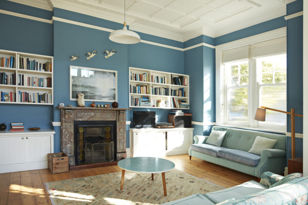
1. Classic blue
 KUPRYNENKO ANDRII / Shutterstock
Classic blue has a calming and relaxing effect, especially when you opt for a lighter shade. If you want to use a darker shade (as outlined below), do so on one or two walls and paint the rest with either a lighter shade or a bright color such as white.
Paint suggestion: Santorini Blue 1634.
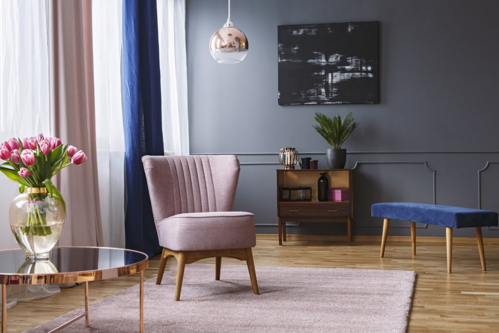
2. Dark blue
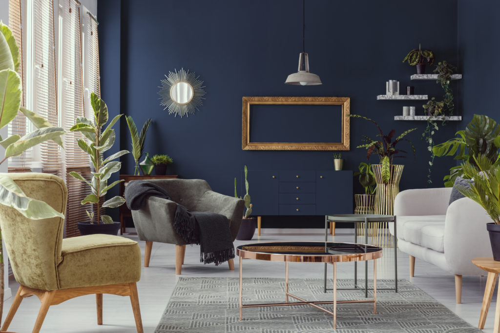 Photographee.eu / Shutterstock
Make a statement and challenge the norm by painting your living room walls a deep shade of blue. However, remember to consider your living room’s natural and artificial lighting. Balance the color scheme by introducing equally bold-colored accessories. Colors such as orange, red and yellow complement dark shades of blue rather well.
Paint suggestion: Hale Navy HC-154 from Benjamin Moore.
3. Coral
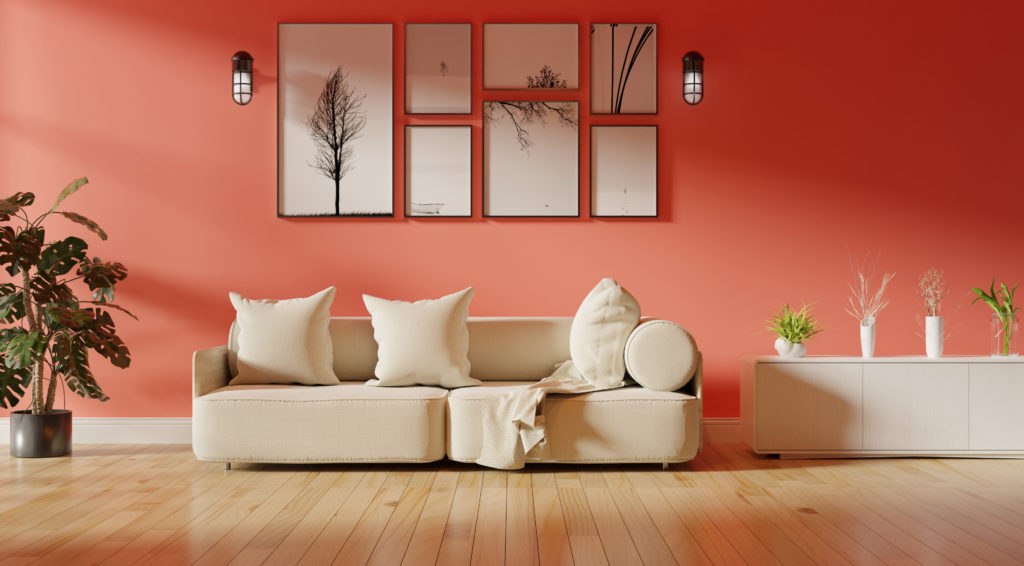 NaksomritStudio/ Shutterstock
Coral is a color that is often associated with coastal homes or those in the tropics. Using coral on your living room walls affords your living room that relaxing coastal ambiance.
Paint suggestion: Sherwin Williams’ 6606 Coral Reef
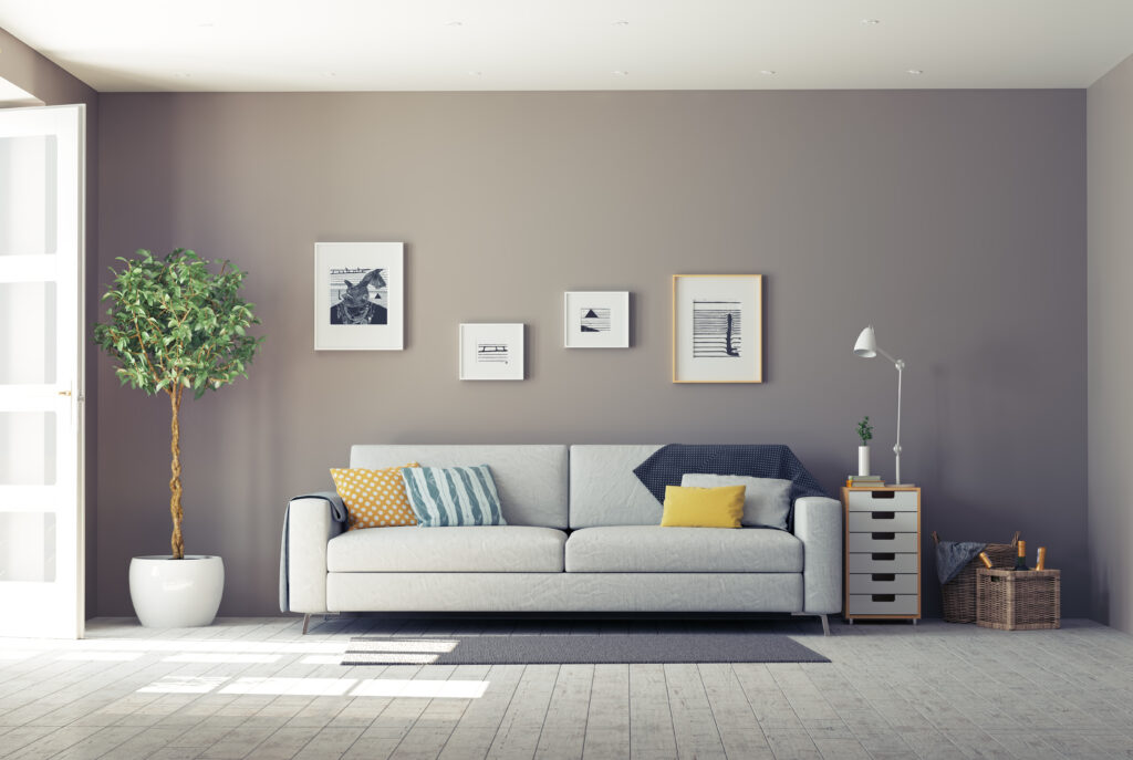
4. Gray
 Photographee.eu / Shutterstock
Painting your living room walls gray gives you an edgy and modern feel along with a classic and timeless appearance. It’s perfect as it suits every setting and any mood you want to achieve while serving as a perfect backdrop for your furniture, accessories and artwork.
Paint suggestion: Behr’s Anonymous 780F-5
5. Light peach
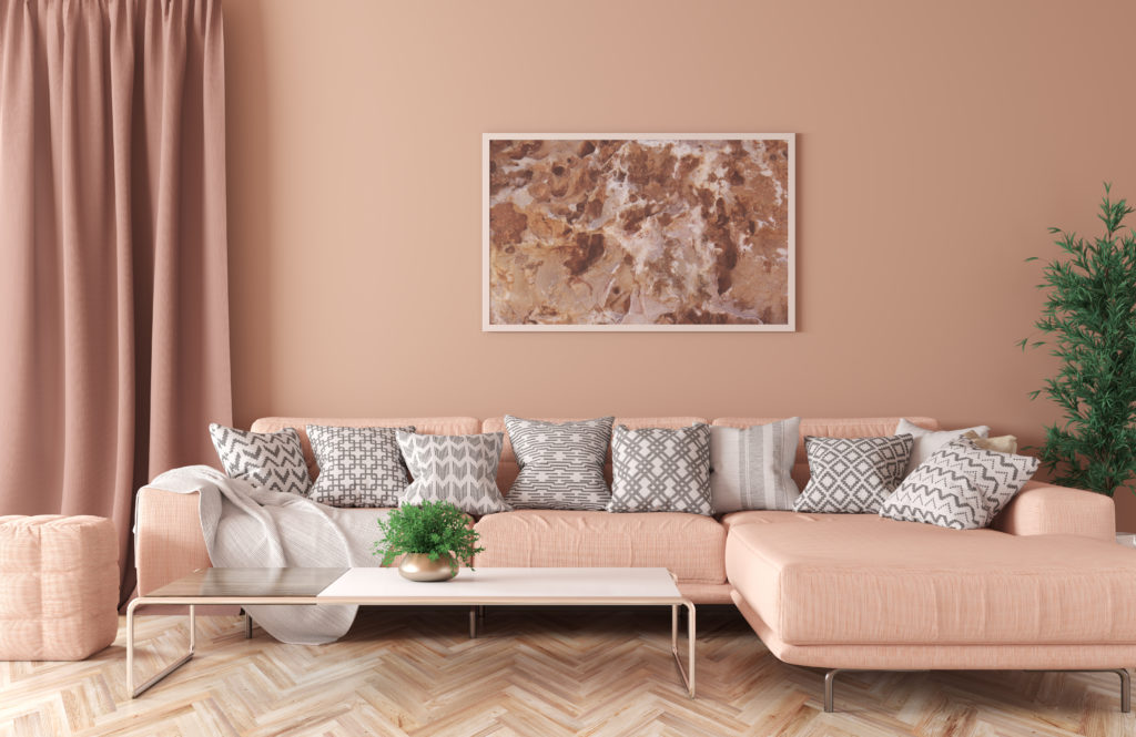 Vadym Andrushchenko / Shutterstock
Light peach on your living room walls is an easy and effective way of making your space look warm and cheery without being overwhelming. While peach is often associated with spring, this happy color is suitable all year round. Create some balance by accenting with dove gray or charcoal walls, furniture or pillows.
Paint suggestion: Light Peach PPG1197-2 from Glidden
6. Lilac
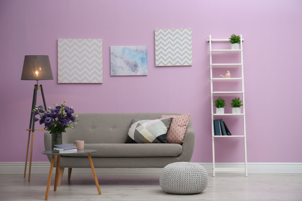 New Africa / Shutterstock
Lilac is a light shade of purple. Using this color on your living room walls helps you achieve a restful atmosphere. Lilac perfectly complements rustic spaces and simple décor.
Paint suggestion: Euphoric Lilac SW 6835 from Sherwin Williams
7. Lime green
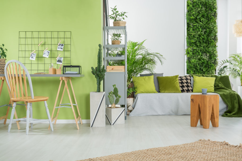 Photographee.eu / Shutterstock
Perhaps due to its strong association with nature, green is thought to evoke feelings of restfulness and tranquility. Pair up your bold and dramatic lime green walls with gray tones.
Paint suggestion: Center Stage SW 6920 from Sherwin Williams
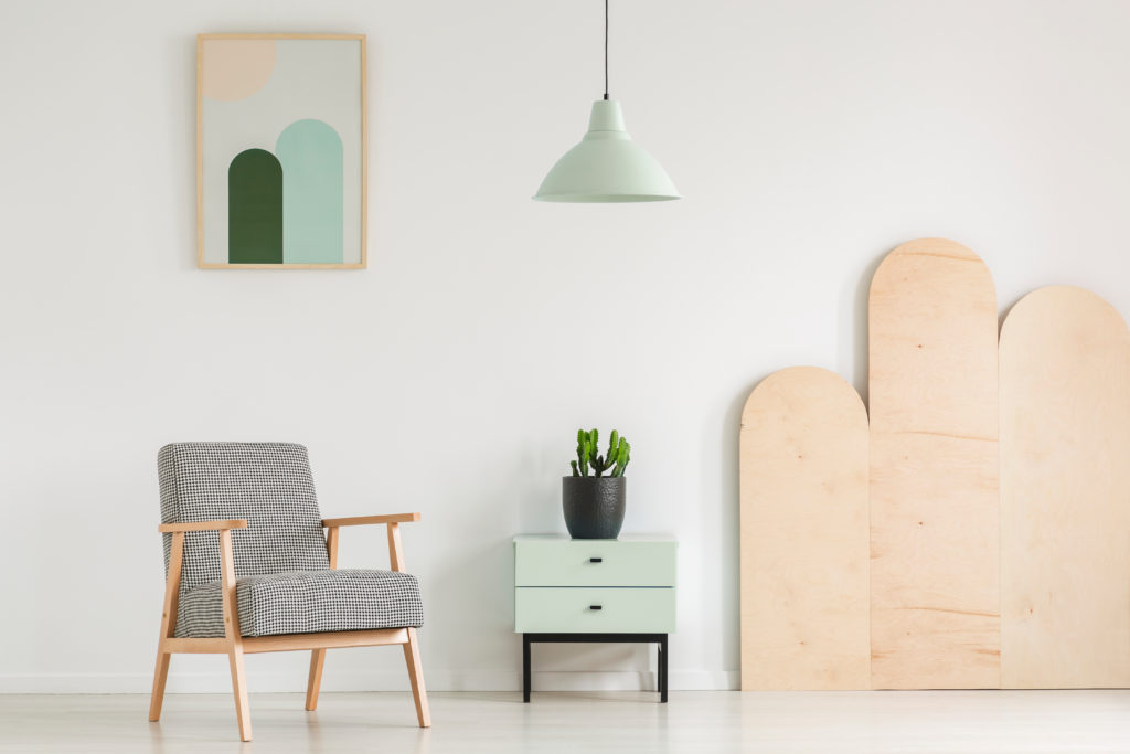
8. Mint green
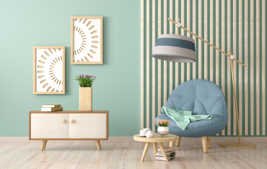 Inna Andrushchenko / Shutterstock
Mint green is a popular color among interior decorators. It brings your living room to life by adding some character and is a charming alternative to whites. Additionally, the green perfectly reflects the natural light creating an earthy atmosphere.
Paint suggestion: Minty Green 2042-70 from Benjamin Moore
9. Beige
 Tr1sha / Shutterstock
Due to its versatility, beige enables you to create a monochromatic interior using two or more tones. Pairing beige walls with brown or bronze furniture and decorations will create a chic and modern look.
Paint suggestion: Behr’s Creamy Mushroom PPU5-13
10. Off-white
 All About Space / Shutterstock
Incorporating off-white walls is an easy yet effective way of making a small room appear large and airy. Off-whites leave a lot of room for creativity—you can switch your furniture or décor without having to repaint the walls.
Paint suggestion: Aesthetic White SW 7035 from Sherwin Williams
11. Pastel blue
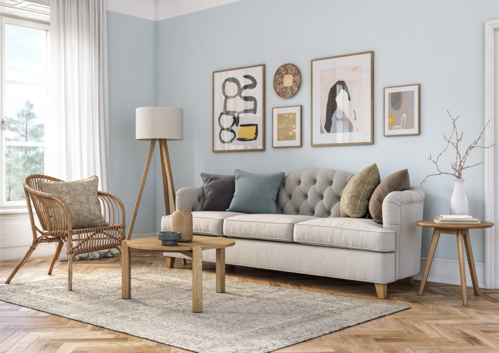 CreativaStudio / Getty Images
Having different shades of blue on your living room walls is said to evoke feelings of clarity, intuition, and pureness. Incorporate two or more blue pastels and turn your bland living room into a warm and inviting space.
Paint suggestion: Bravo Blue SW 6784 from Sherwin Williams
12. Pastel pink
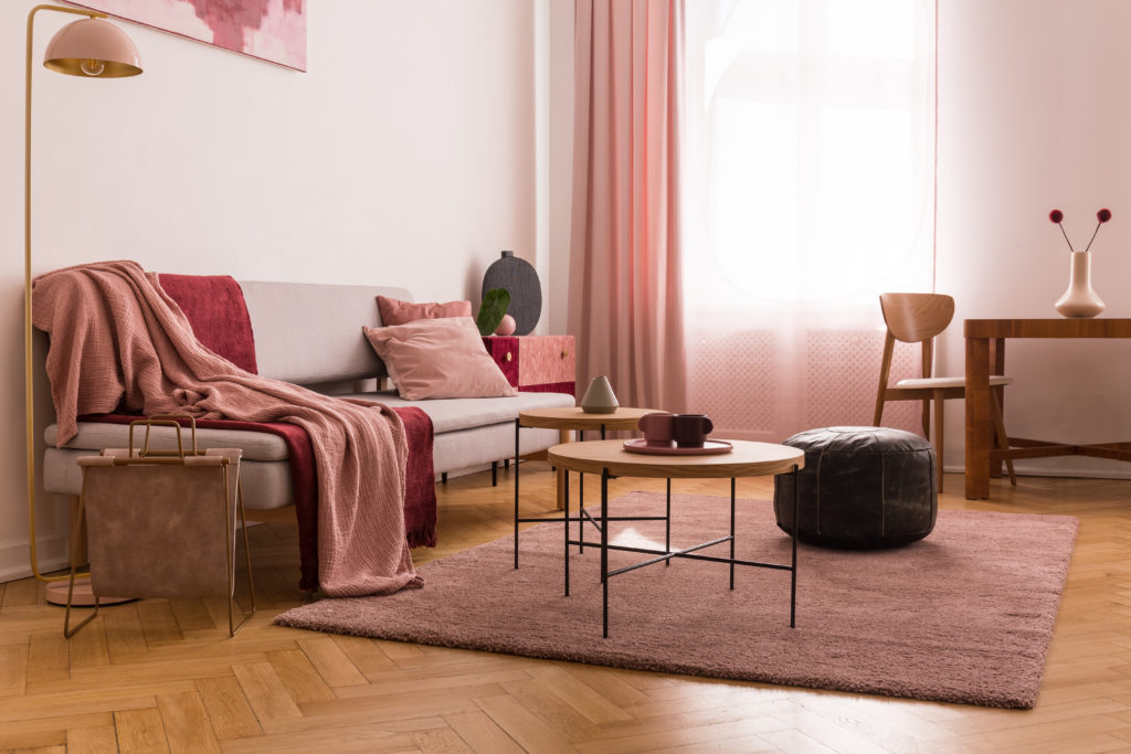 Photographee.eu / Shutterstock
Although pink is not considered a neutral color, it does give you a lot of versatility when combining colors which means you can do a lot with your furniture and decor. Incorporating different shades of pink on your living room walls can help you achieve varied themes and styles.
Paint suggestion: Panache Pink SW 6848 from Sherwin Williams
13. Raspberry
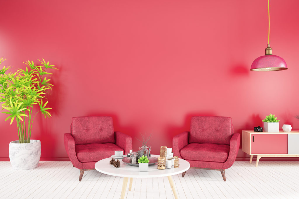 asbe / Getty Images
Raspberry is a rather vibrant color that will complement most other color choices in your living room. This rich pink is bound to create a punchy and energetic atmosphere. Pair it with contrasting hues such as browns or chartreuse green.
Paint suggestion: Behr’s Glazed Raspberry 120D-5
14. Sage green
 Photographee.eu / Shutterstock
Sage green is not only easy on the eyes but it is also soothing and laid-back. This color provides you with an earthy and classical feel and remains very common amongst minimalists.
Paint suggestion: Money Moves from Clare
15. Yellow
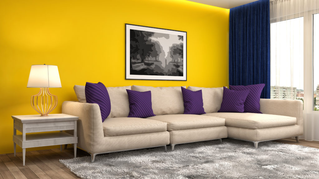 Interior Design / Shutterstock
Most people thinking of brightening up their living room will probably go for white on white. Yet going yellow is an easy way of making your living space feel bright and sunny. If you want to help neutralize a yellow color on your walls, bring in some dramatic wall art or dark furniture.
Paint suggestion: Fun Yellow SW 6908 from Sherwin Williams
16. Ocean blue
 Klaus Vedfelt / Getty Images
Blue living room walls are as flexible as they are chic and stylish. Ocean blue walls for your living room provide you with a perfect backdrop for stronger hues such as turquoise or green. Walls in this color also complement wooden floors perfectly.
Paint suggestion: Clearest Ocean Blue 2064-40 from Benjamin Moore
17. Tangerine
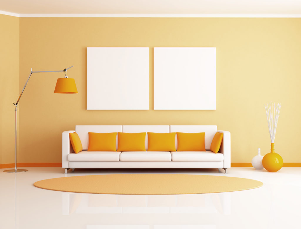 archideaphoto / Shutterstock
Tangerine is not only eye-catching but also adds warmth and brightness to your living room in ways that neutral colors cannot. Tone it down with colors such as khaki, black or brown.
Paint suggestion: Tangerine SW 6640 from Sherwin Williams
18. Taupe
 Artazum / Shutterstock
Taupe has properties of different colors such as brown and grey and is available in a wide range of undertones. Taupe-painted living rooms are easy to decorate as this color can be paired with just about anything.
Paint suggestion: Devonwood Taupe 1008 from Benjamin Moore
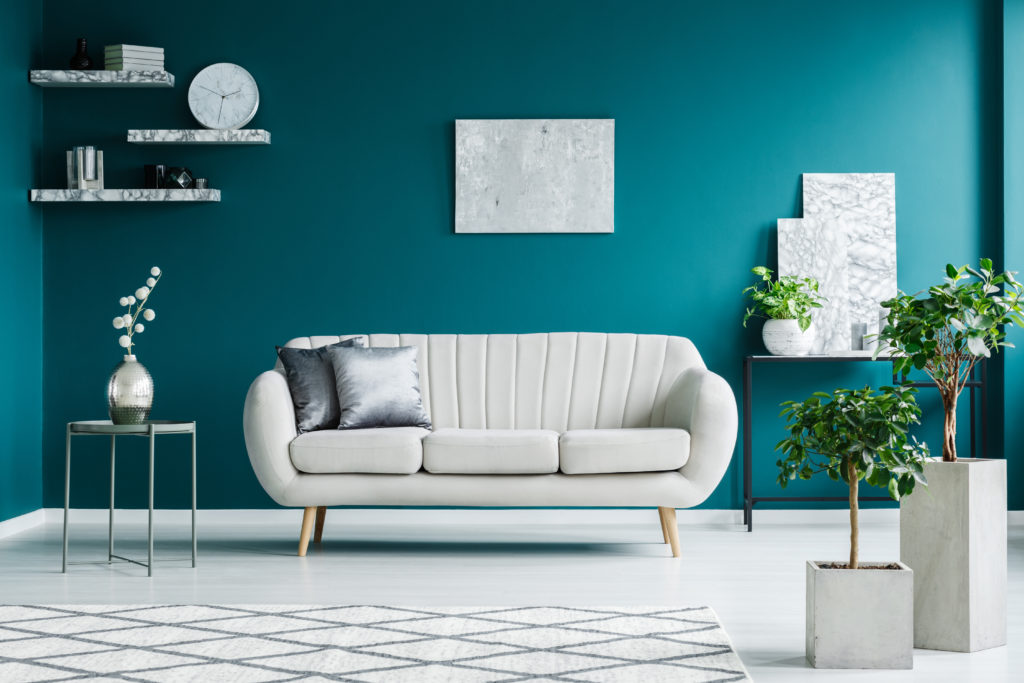
19. Teal
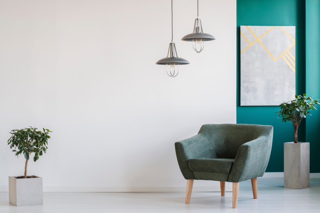 Photographee.eu / Shutterstock
Teal gives your living room a sense of depth, intrigue, and mystery. You can either warm it up or cool it down to suit the current season. If you prefer furniture with lighter shades, choose a darker shade of teal and vice versa.
Paint suggestion: Romantic Isle PPG1231-7 from PPG Paints
20. Turquoise
 Photographee.eu / Shutterstock
While it is considered an exotic color, turquoise is actually quite an easy color to style. Depending on your aesthetic, it can be soft and subdued, rich and bold or bright and playful.
Paint suggestion: Sea of Turquoise 90GG 37/212 from Glidden
Frequently Asked Questions
What is the best color for a living room?
There is no one “best” color for your living room. Rather, it all depends on your personal style and preference. Use your living room’s decor, design and existing accent colors to help influence your choice.
What colors make a living room look bigger?
If your goal is to make your cramped living space look bigger, choose cool colors such as whites and grays, or light shades of blue and green. These colors reflect light and make your space appear bigger.
How do I choose a living room color?
When choosing your room’s color, consider its size, shape and lighting. Light colors will brighten up a poorly-lit room while dark colors will provide you with a dramatic look. Vibrant hues will give your living room a bright, cheery ambiance.
How do I know how much paint I need for my walls?
In addition to selecting the right colors and products for your living room painting project, you have to assess how much paint your project requires. You can do this by measuring the surface area to be painted and dividing it by the paint’s estimated coverage rate.
Related Articles

And How Rhino Roofing Can Help You Avoid Them When it comes to selling your home, the last thing you want is for the deal to fall through because of a roofing issue. At Rhino Roofing orlando, we know that a roof is more than just shingles—it’s your home’s first line of defense. A roof […]
Read More
Moving can be one of the most stressful life experiences a person can go through. And during the moving process, some of us may find it more difficult to get a good night’s sleep. To get a better understanding of how the moving process can affect a person’s sleep quality, we spoke with Nationally-Board Certified […]
Read More
This is paid content. It was written and produced by MYMOVE in partnership with Home Chef. Whether you love to cook or you struggle to put together a PB&J, the moving process will have the best of us scrambling to put something edible on the table. That’s why meal delivery services like Home Chef are […]
Read More