10 Designs That Incorporate The Rule Of Three
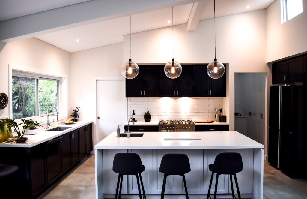

Barefoot_Traveller/ Twenty20
You have probably heard this statement before—Always follow the ‘Rule of Three’ when decorating your home. What is this mysterious rule of three and how do we incorporate it into our home—and aren’t rules meant to be broken? Most designers will tell you that the rule of three was put into effect due to the fact that an odd number of items look more natural and less forced than an even-numbered grouping. Why is this? Well, mostly because too much symmetry makes a room look stale and cold (although, we all know symmetry plays a huge role in the design, too). Essentially, there is a balance to be found between symmetry and asymmetry. In order to make this balance more clear-cut, we have gathered a library of ten room designs that follow this rule of three–some follow it to the letter, others show how flexible the rule can be, and then some outright break the rule. Let’s look at these rooms to see how designers have dealt with this rule and how, at times, they have successfully broken the rule.
1. Three Colors In A Room
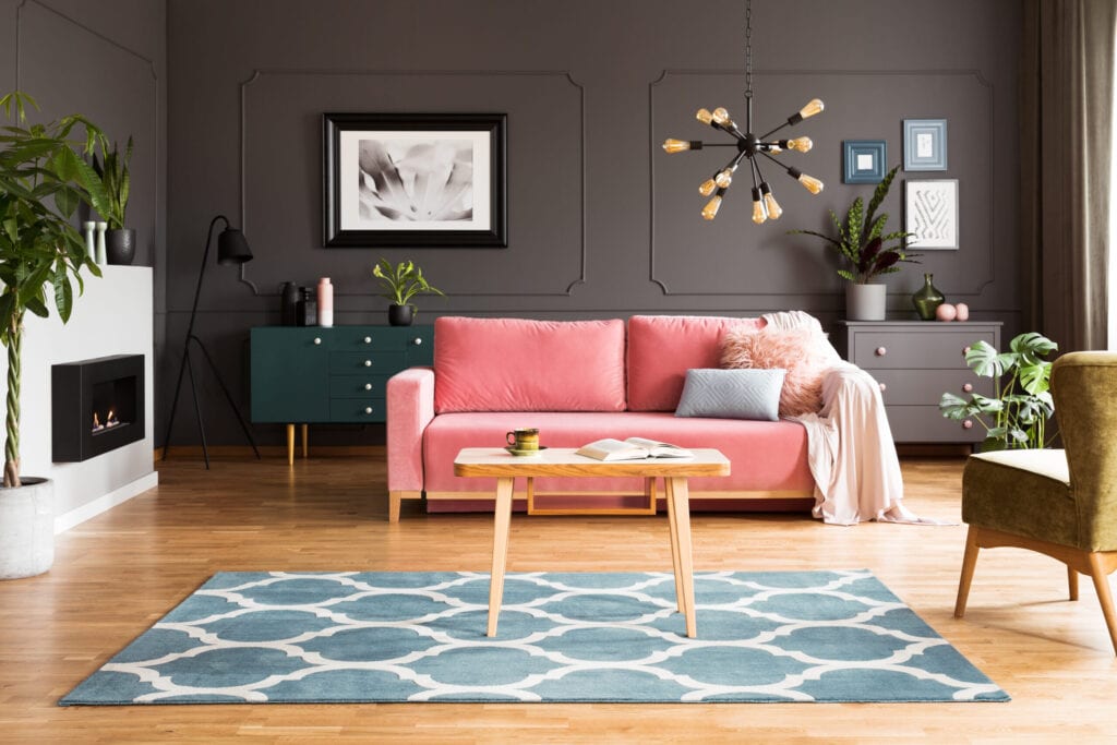
As shown in this WikiHow article, there is a standard equation that works best when choosing room colors—60, 30, 10.60% being the main room color, 30% being the secondary color, and 10% being the accent color. This ratio can be applied to all interior and exterior colors that you choose for your home. Take for example your living room— 60% may be a neutral beige, 30% may be a bold navy blue accent wall, and 10% could be coral-colored throw cushions with navy blue trim/accents. If bold color combinations are not for you, then choose three varying shades of the same color for a neutral, more calming room design. Either way, if you follow the rule of three when choosing colors, then you are guaranteed to achieve a room that is well-designed and welcoming.
Photographee.eu/Shutterstock
2. Three Textures Look Best
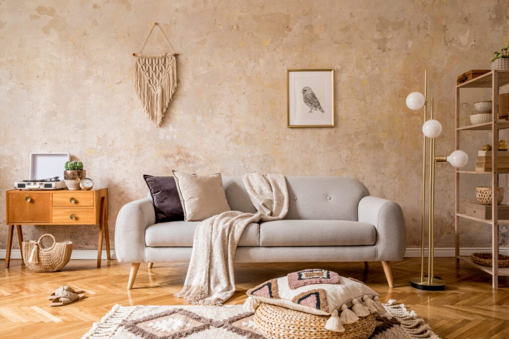
Have you ever looked closely at an all-white room? If you did, then you probably noticed that the room is not really all-white, even though it initially appears that way. In fact, upon closer inspection of an all-white room, you will see numerous shades of white, cream, beige, and brown. You will also notice a lot of different textures—wood, rattan, linen, and nubby cotton. Yes, this rule of three extends to room texture, as well. Notice the room in the image below; it has the rough texture of numerous wood accent items; it has a nubby linen fabric on the chairs; it has a rusty steel shade covering the pendant light. These three main textures combine within this room, offering a visual treat and creating a warm atmosphere within the otherwise neutral-colored theme.
FollowtheFlow/ Getty Images
3. How To Combine Three Fabrics
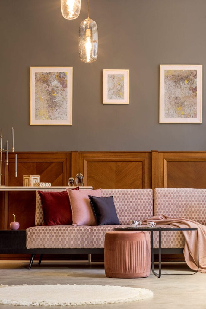
Combining fabrics can be tricky. It can be tempting to just pick one fabric that you love and use it on your curtains, pillows, etc… but wouldn’t that be really boring, and probably over-powering? When designing any room in your home, it is best to choose three fabrics that play up one another’s colors, patterns, and textures. Threads may be a sewing magazine, but their article offers very helpful ways to choose color combinations that can be applied to your interior design. They suggest you lay-out all your fabric options and choose fabrics based on texture, pattern and color.A no-fail approach is shown in the room below— floral, damask and plaid combine perfectly together and play up each other’s green and red accents. When in doubt ask a designer for assistance; they can offer numerous fabric combinations for any given room in your home.
FollowtheFlow/ Getty Images
4. How Many Light Fixtures Should A Room Have?
Three, of course! Yes, you cannot escape this rule of three even when it comes to lighting. This doesn’t mean that a room should only have three lights in it, rather it means a room should have three different styles of lighting. Usually, a room should have one overhead light (on a dimmer), numerous lamps on side tables, and then accent lights such as picture lights, or track lighting, or under-cabinet lighting. In the image below, the room has one large overhead lantern, a table lamp, and then accent lighting on the bookshelves. Essentially, most rooms should be lit by one main ambient light, task lighting (via side table lamps and floor lamps), and then accent lights. All of these layered light sources combine to create a balanced room.
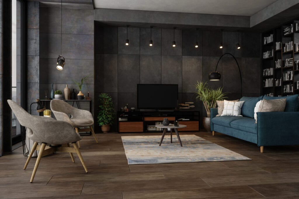
onurdongel/ Getty Images
5. Arrange Furniture Using The Rule Of Three
Arranging furniture within a room can seem like a mystery. There seem to be too many rules when it comes to furniture placement. While you may be tempted to ignore some of those rules, we suggest you follow the rule of three in order to achieve a room that functions and flows. Whether you have one large sofa and two large club chairs, or two dainty love-seats and one delicate chair—the rule of three will help you place your main furniture into cohesive groupings. It is important to create furniture groupings where size and shape mimic each other, creating an integrated look. The room’s visual height and scale can be adjusted with other various-sized objects, but furniture should be similar in size/scale/shape when grouped together. Look to the bedroom in the image below; it is a very symmetrical room with one large bed and two large side tables—it would have looked “off” to have placed one small square ottoman at the foot of the bed, the scale would have been wrong. By placing three of the smaller ottomans, the room has maintained the correct scale and has an added visual interest.
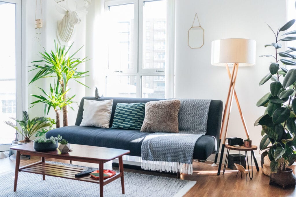
Oscar Wong/ Getty Images
6. Coffee Table Vignette
Arranging a coffee table or bookshelf vignette seems like some mysterious art; an art that only a select few know how to pull off. Luckily, an artful and pleasing vignette can be arranged anywhere in your home by following the simple rule of three. When creating your coffee table arrangement, it is important to consider height, scale, and color. Try to pick three objects or three groupings of objects whose scale and colors go with one another and with the surrounding room. In terms of height, you can mix it up a bit (varying heights add visual interest). If there is a smaller scale item that you would like to add to your grouping but you worry that it is too small, then consider making it appear larger by placing it atop a stack of books or atop a pedestal cake display or tray.
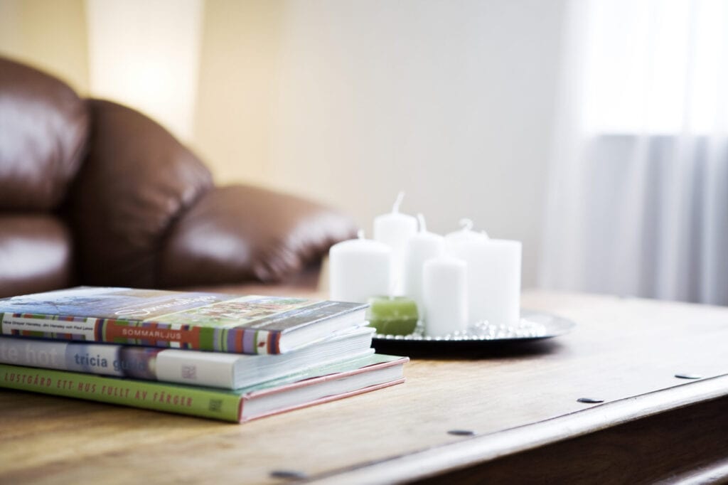
Kentaroo Tryman/ Getty Images
7. Don’t Take The Rule Of Three Too Literally
Now that we have hammered this rule into your head, we are going to take a step backward and tell you not to take it too seriously. Don’t run about your homemaking arrangements of three everywhere. Symmetry is not bad, nor is breaking the rules. The rule of three is a guideline that can be bent. Essentially, it was put into place so that people understand that an odd-number of items is more interesting than an even number of items. So, yes, you can arrange 5 items or 9 items into a grouping and still achieve the same visual interest. As an example, look at the gallery wall below. You will count 5 main items within the display, and they are all varying in size, height, and shape. So don’t be scared to mix it up and have fun.
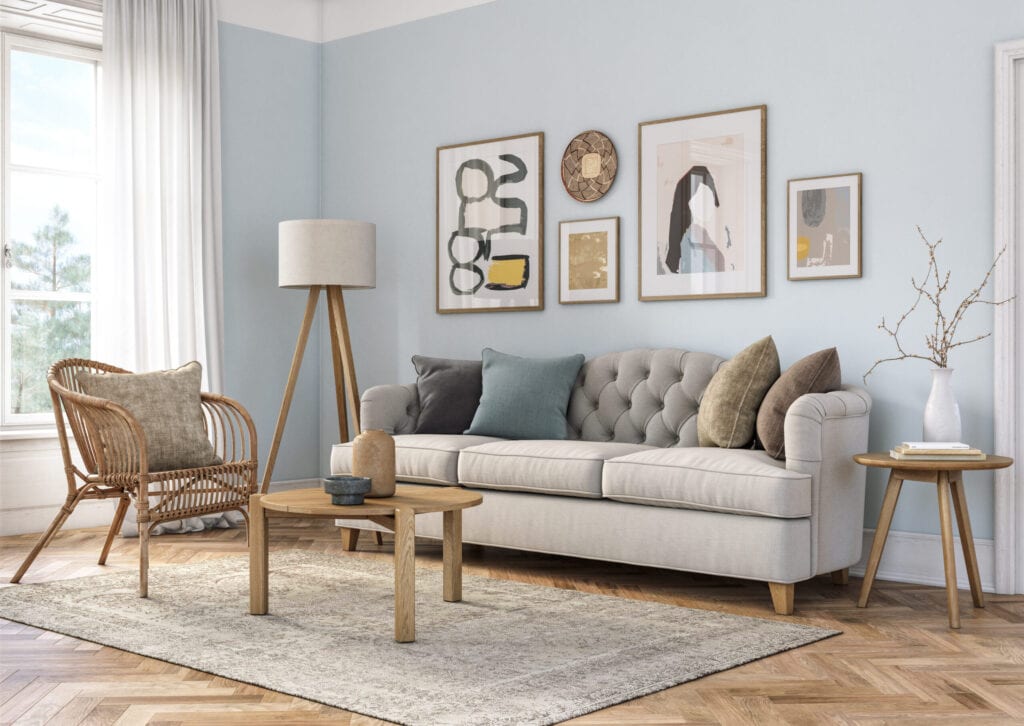
CreativaStudio/ Getty Images
8. Windows in Three’s
While symmetry in architecture is imperative for a balanced design, there can be a nice touch of visual fun by imparting the rule of three into your home’s architecture. While one side of the house may have 1 large window, the opposite side could feature 3 smaller windows whose scale, when combined, match and balance with the larger singular window. This is just a fun way that your home design can be unique and play with visual symmetry and balance. The image below shows a great example of this; its three smaller windows balance well with the opposing large window by matching height and scale.

Taylor Davidson / EyeEm/ Getty Images
9. Even Minimalist Interiors Follow The Rules
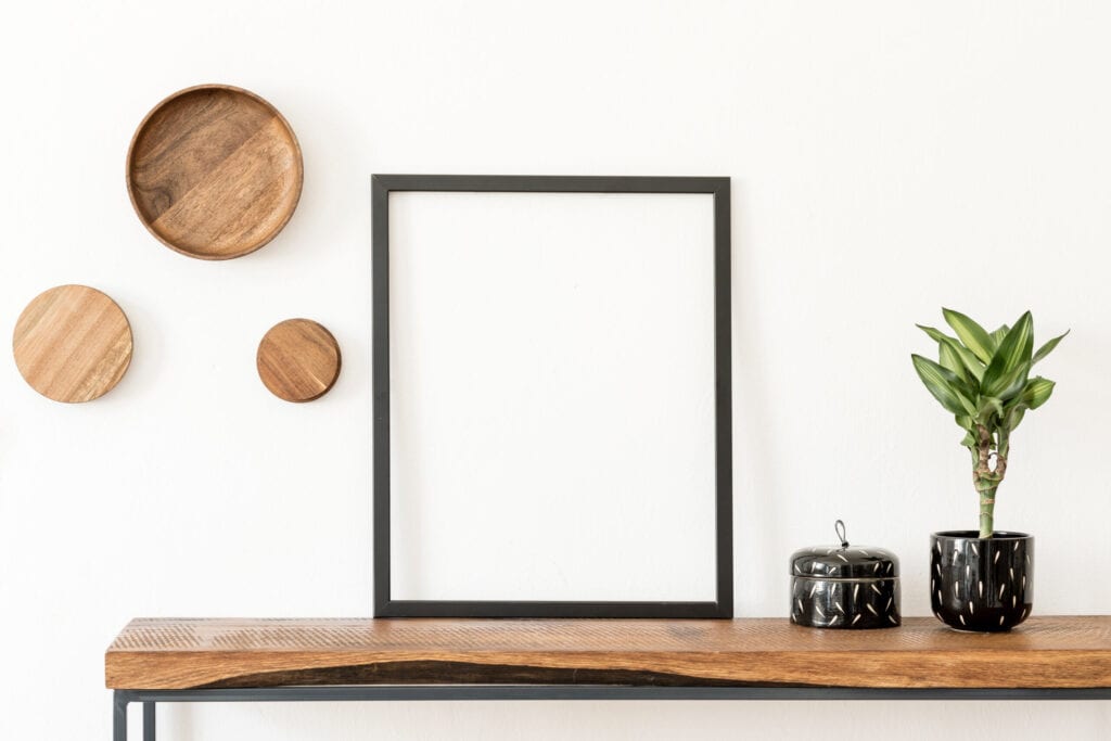
When it comes to minimalist design, it is best to avoid a lot of clutter and knick-knacks, but the rule of three can still be used to add visual depth and interest to even the most minimalist of interiors. A contemporary design can still incorporate this rule by arranging its furniture into odd-number groupings, or by placing 3 simple objects onto a coffee table. The image below shows a clean black and white room with three large pictures lined up against the wall. Try covering up one of those pictures with your thumb…it’s not nearly as interesting, is it? Same with the dining room table; if you took away the third component of the candles then the two vases of flowers would seem boring. Odd numbers rule, even in minimalist design.
FollowTheFlow/ Getty images
10. Scale Overrules All Other Rules
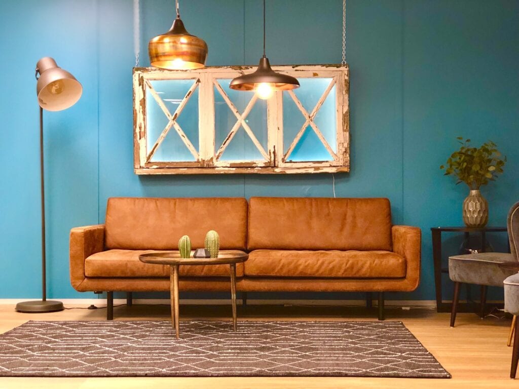
While we have shown that the rule of three adds visual depth and interest, there is something that makes that rule null and void—Scale. The scale or size of your room or items within your room may require you to break the rule of three. If the island in your kitchen is small, it may look cluttered and over-powering to have three large pendant lights dangling above it, forcing you to only have two pendants instead. Or if you have a small, dainty coffee table it may look too “heavy” to arrange three items on top of it. On the other side of the scale spectrum, an item may be very large and require more than three items in order for it to maintain its balance. Balance the rule of three with the scale of the room and its objects within, ensuring that your room is well-proportioned and scale-appropriate.
alisevalise/Twenty20
The rule of three is not so mysterious anymore—it is simply a fun way to add depth and visual interest to your home. Play with this rule and don’t get too caught up in the details of it. No matter what, rules can be broken, and sometimes the scale of an item doesn’t allow you to follow the rules. Take pictures of your arrangements and let the camera tell you if something is “off”—pictures are great at revealing problems with the scale of your arrangements. Most importantly, have fun—decorating is not meant to be dreary. Do you believe the rule of three? Have you tried it in your home?


