These Are The 2019 Color Trends We’re Loving
The new year is here, bringing with it all sorts of new interior design trends to fawn over. Today, however, we’re focusing exclusively on color. Each year, color giants like Behr and Sherwin-Williams release their top picks for which colors will soon be everywhere. From their wide selections, we picked the 2019 color trends that we think are most likely to take off and laid out how to use them. Read on below to get ahead of the curve.

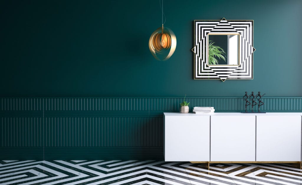
A dark green shade called “Night Watch” is PPG’s 2019 Color of the Year. Image: Jafara/Shutterstock
Dark greens
Recently, a dark green shade called “Night Watch” was given the honor of being named PPG’s Color of the Year. According to a senior marketing manager with PPG, this color was chosen because “the restorative power of nature is important in society now more than ever. Night Watch is about bringing the healing power from the outdoors into your home through color.”
We couldn’t agree more. We’ve progressively been seeing nature-inspired decor take over our interiors. From incorporating live plants to embracing the jungle trend, we can’t get enough. That’s why we think dark green shades are set to be everywhere this year.
As for how to use this shade in your home, embracing dark greens is all about creating a bold look. Pair it with darker neutrals like black and brown or opt for an even more on-trend aesthetic and incorporate some jewel tones. Choose warm metals like copper or gold to create a sense of contrast.
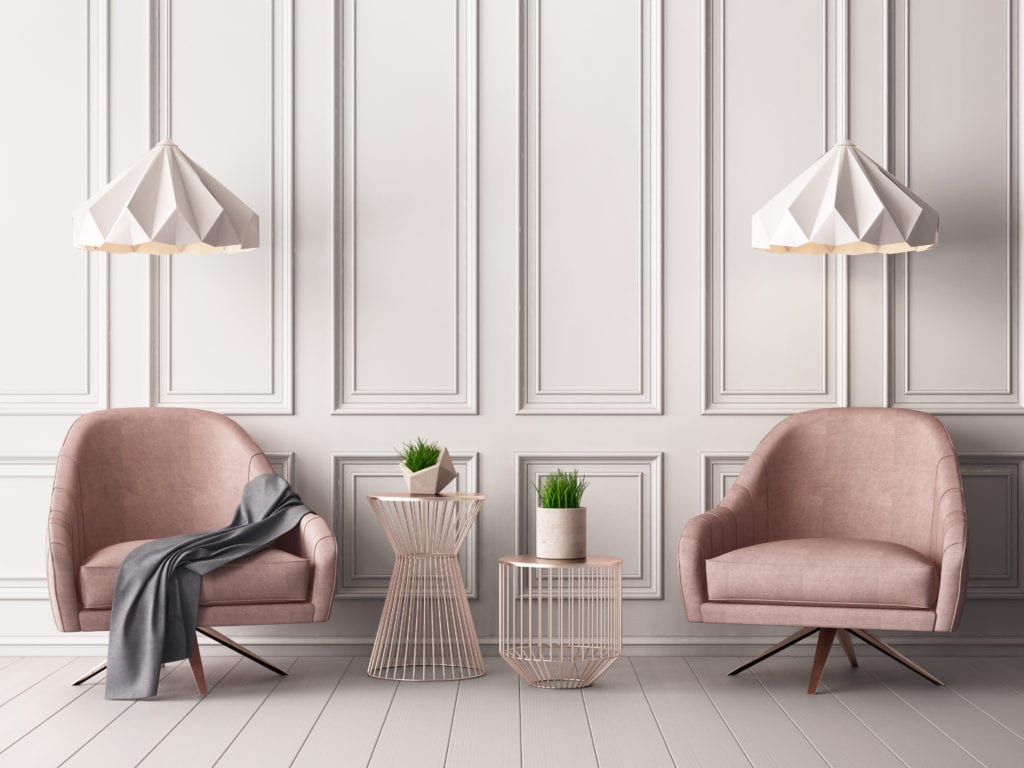
Bye, Millennial Pink. Hello, Dusty Rose. Image: Philipp Shurue/Shutterstock
Dusty pinks
For years, the cheekily-named Millennial Pink has graced us with its presence. It was nearly impossible to see a scandi-inspired interior without it. However, 2019 is all about change. These days, we’re seeing the bright, almost bubblegum hues of Millennial Pink being replaced with a more subdued, timeless version. It’s time to say hello to dusty pinks.
This year, as part of their Colormix Color Forecast, Sherwin-Williams released 42 trend-forward shades that spanned six unique color palettes. Dusty pink shades showed up on three of them. For us, that’s enough indication that this color will soon be everywhere.
This color is a wonderful accent shade. Use it in an accent wall, a piece of statement furniture or some throw pillows. You can bring out the color to its fullest by pairing it with plenty of white, which will give your design a sense of contrast. Alternatively, you can go a bit more playful and round out the look by incorporating plenty of richer reds or pale blues.
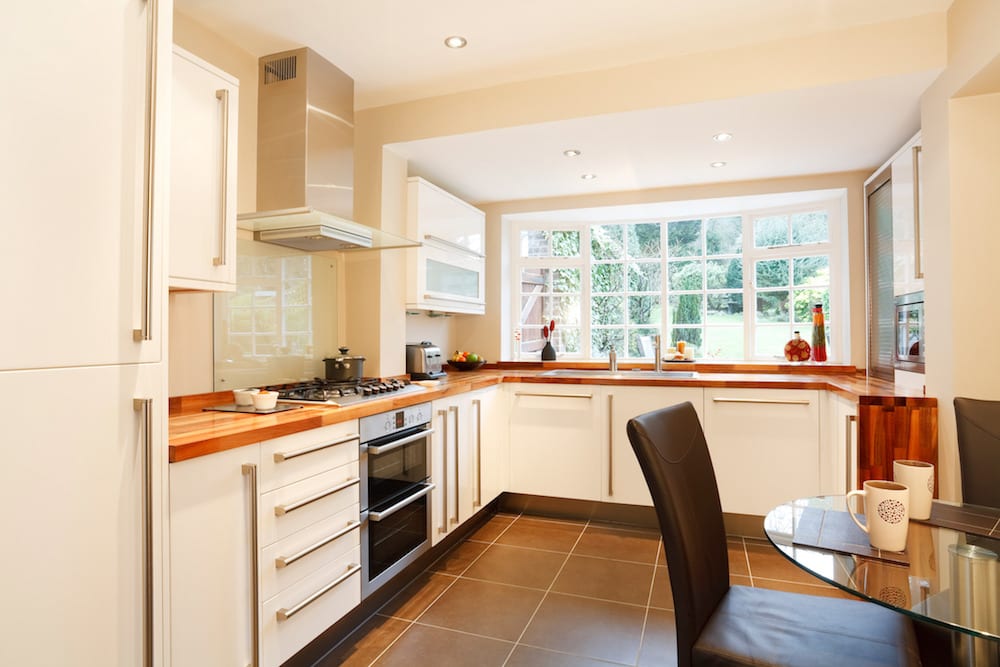
Warm creams are the new “it” neutral. Image: Paul Maguire/Shutterstock
Warm creams
Since the era of gray-everything is finally coming to an end, it’s time to zero in on a new neutral to take its place. Enter warm creams. This group of colors is especially exciting because it offers the perfect middle ground. It’s less stark than the all-white interiors we’ve grown used to seeing in conjunction with modern aesthetics, yet it’s less expected than a traditional tan shade.
Benjamin Moore’s Color Trends for 2019 feature two distinct cream-inspired shades: “Cloud White” and “Balboa Mist.” With just 15 colors in total, that’s not a bad percentage. However, we suspect this is just the start of seeing warm creams crop up everywhere.
Using this color is all about adding a sense of warmth and serenity to the room. Think about pairing it with warm neutrals like browns and tans. Serene blues and grounding earth tones are also a good match. In this case, you’ll want to stay away from colors that feel harsh and opt for more muted versions.
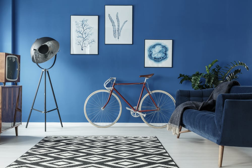
“Blueprint” is Behr’s 2019 Color of the Year. Image: Photographee.eu/Shutterstock
Medium blues
Our final 2019 color trend alert is for medium blue shades. This one comes to us from Behr, who named a hue called “Blueprint” their 2019 Color of the Year. On the choice, Erika Woelfel, Vice President of Color and Creative Services at Behr, explained, “Much like the sketches builders rely on to bring an architectural design to life, Blueprint S470-5 lays a foundation for consumers to make their unique vision a reality. This universally appealing hue provides a steady stream of positivity and is poised to be an instant classic for years to come.”
We like “Blueprint” – and shades like it – because they’re incredibly versatile. On the one hand, like navy, a medium blue can be used as a neutral shade. It can stand up to bolder colors like vibrant reds and yellows. However, on the other, a medium blue shade can also be an accent color. Itan be the pop of visual interest that livens up an otherwise neutral design.


