Advertising Disclosure
We are an independent publisher. Our reporters create honest, accurate, and objective content to help you make decisions. To support our work, we are paid for providing advertising services. Many, but not all, of the offers and clickable hyperlinks (such as a “Next” button) that appear on this site are from companies that compensate us. The compensation we receive and other factors, such as your location, may impact what ads and links appear on our site, and how, where, and in what order ads and links appear. While we strive to provide a wide range of offers, our site does not include information about every product or service that may be available to you. We strive to keep our information accurate and up-to-date, but some information may not be current. So, your actual offer terms from an advertiser may be different than the offer terms on this site. And the advertised offers may be subject to additional terms and conditions of the advertiser. All information is presented without any warranty or guarantee to you. For more information, please see How we make money.How We Make Money
We are an independent publisher. Our reporters create honest, accurate, and objective content to help you make decisions. Our advertisers do not direct our editorial content. Any opinions, analyses, reviews, or recommendations expressed in editorial content are those of the author’s alone, and have not been reviewed, approved, or otherwise endorsed by the advertiser. To support our work, we are paid for providing advertising services. For example, some advertisers pay us to display ads, others pay us when you click on certain links posted on our site, others pay us when you apply for and receive a product, and others pay us when you submit your information to request a quote or other offer details. We don’t charge you for our services. The compensation we receive and other factors, such as your location, may impact what ads and links appear on our site, and how, where, and in what order ads and links appear. While we strive to provide a wide range of offers, our site does not include information about every product or service that may be available to you. All information is presented without any warranty or guarantee to you, and all offers may be subject to additional terms and conditions of the advertiser. For more information, please see our Advertising Disclosure.
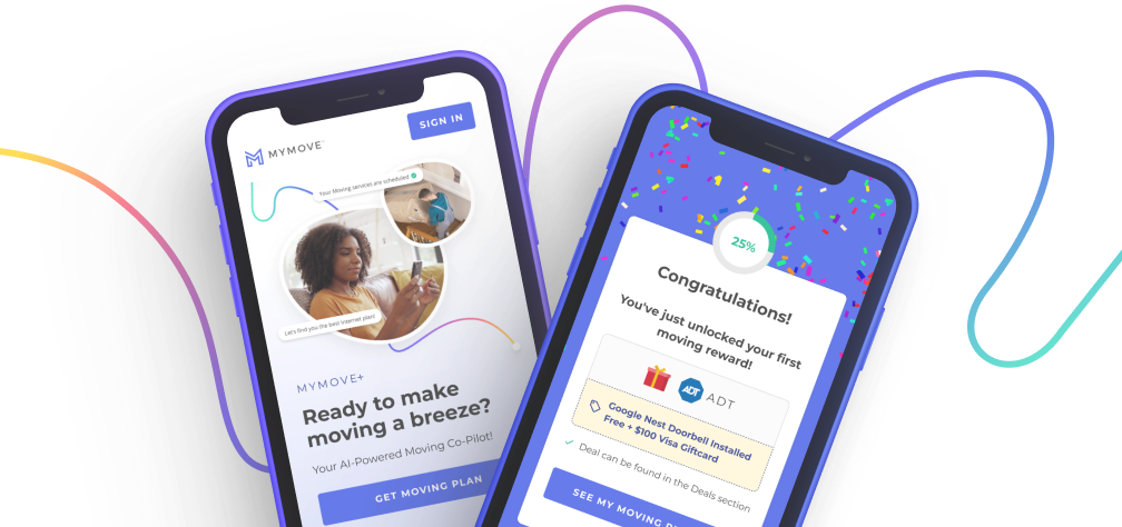
Every move is different, make
this one
yours.
Meet MYMOVE+, your free, AI powered moving assistant, and let us help make your move stress free. Try it today!